Reminder

I have been in Cancun for a wedding since Thursday.  Daily internet cost an arm and a leg.  I wasn't willing to sacrifice either.  Jumped on a friends computer.....to remind you of the giveaway which you can see here.  Picking a winner on Nov 3rd.

Life will get back to normal without the beach, and people waiting on your every stinking need on Tuesday.  Rats.
3

Something free.... and a few things WAY expensive!


OK....first things first!  I am giving away another glass tray.  This time you get to pick the one you want from three different selections!  They are all the same size: 5" by 8".
Here they are:
or....
or....
I do love this guys face!!!  You have until Wednesday Nov 3rd.  Become a follower and leave a comment if you want one of these little gems.

On another note, I was in a showroom the other day and saw some beautiful light fixtures.  They were incredibly expensive, "need to win the lottery" expensive.  Need to have "Big Poppa" as my boyfriend expensive....yuk...just the thought of that puts a bad taste in my mouth.

They were from Niermann Weeks, a company based in Annapolis Maryland which by the way is having their sample sale next week.  I have a friend who  has been to that sale and scored!  Wish I could go. [pout]
Here is the first one [and a similar less expensive version following]:

10,080.00
Similar one which I LOVE:

Overstock: 359.99

Niermann Weeks: 7,410.00
Visual Comfort: 455.00
Niermann Weeks:  4,380.00
Visual Comfort: 623.90

And last but not least, isn't this the cutest???  It is going in my foyer to put my keys on. And....I could afford it!
I ordered it from here.  They have other colors and other cute things :)

So.....free...expensive...affordable!  Choices.


21

A pretty big before and after!

Loved all the comments on Angie's blue doors.  I was over there yesterday and took some more shots, so I will be posting them soon.  We are leaning towards the gray only because it doesn't show the dirt as much but we are putting up samples this week.  I will keep you posted.  Now on to a great before and after.

I have posted on the bedroom redo in this house here.  Here is  another makeover in the girls playroom in the same house.   Hold on to your hats because this before picture is quite the shot!
 
When they moved in this room  kind of got mostly left over furniture from other rooms.  If you look really hard you can see a piece of exercise equipment.  Across from the sofa is the TV and with 4 girls, this room gets much wear and tear!

We started by re- purposing  the 2 sofas that were in the keeping area off the kitchen.  Here is a picture of them.

Maybe we could have bought 2 new ones but I did love the tuxedo arm and they size was good.  Sometimes you have to take into the consideration the time it would take to  search for new.   We only had 6 weeks to do the whole house.

Here is the room after major editing!!!!!
Another before:


We had the back cushions made a little taller, added the button in the middle, and a little bit of nailhead around the feet.
The rug was formerly in the master bedroom, so that was our inspiration for the color scheme.

I think the sofa's look like new!  
The coffee table was oak and we had it stained black.  You can still see the wood grain in it.  The bench was from Homegoods.  Had the legs also stained black, recovered and we added the trim with the nailheads on top.
I wish I had a before picture of the corner.  She had the cart and the mirror in the garage.....after some staging,all we did was buy the lamp.  We had the room painted a grayish white and the TV case, and all the windows painted a darker color.
The window seat before.
And after....
Before:  This is the hallway leading into the room.  There is a microwave and sink for popcorn making etc.
They had the bench, we added paint and a cushion.  New rug.

I wish I had more pictures of the area behind the sofa.  I also need to get some shots of a small bath off this  room.  
The whole room transformation took a lot of organizing and purging!!!  And I have to say they were thrilled with the outcome.


16

I'm still on the blue doors.....check it out!

Thanks to everybody for all the input on the blue doors for Angie!  She is definitely starting to re think changing the color  and is going to wait until the house is painted to make a decision.  I found OK...Maria actually found these pictures for Angie [she would be all over this blog with snide remarks if I did not give her credit]  but they were pretty persuasive for the "keep" decision.  


This is how it would look with white...I like!

Looks good with a gray green also.
Stone...

White and stone.

Those are pretty good examples.  I might have to make Maria my assistant.  Even though it is not actually a paid position, the perks are good :)


9

I need an opinion!!!

A friend of mine, Angie,  recently "stole" a house, I say that because it was on the market for $375 thousand and they purchased it for $205 thousand.  It is a cute little 2 bedroom/2 bath bungalow.  Of course it needs some work taking down walls inside, updating bathrooms, but it is in a great location near the Emory area in Atlanta.  

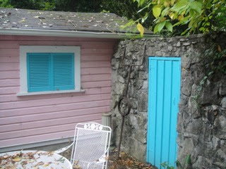
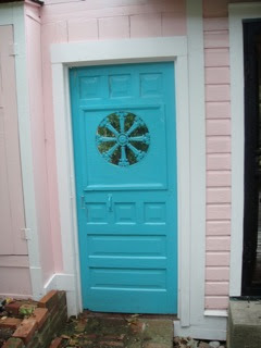
I went over the other day to take a peek as the guys were there starting a little demo.  The whole house is painted pink!  Yep.  You can't miss it.  BUT.....when I saw these doors I was adamant that she not change the color.  They both looked at me like I said they were standing in a pile of snakes!  So I said I would put it on my blog for a vote.
That great stone wall goes all across the back yard which is bricked in and very english looking.  Try to look past the pink....and think gray with white trim....
This door leads out of the back yard on the opposite side.
A close up of that same door on the stone wall.
The black door leads into the master bedroom.

So am I crazy?  I am biased because turquoise is my favorite color but I really think it adds to the patina of the house.  Let's hear it...yes or no.


19

Want To Get Published?????

I have to tell you there is nothing more empowering than having your design work published.  Today, I have an interview with Lisa Mowry, who is an editor for Better Homes and Gardens, Traditional Home, Renovation Style,and Southern Living to name a few.  She has been producing articles for Shelter magazines for  20 years and has the privilege of working with a talented team of Atlanta photographers and stylists.  She has some great  articles out now which include: November's Atlanta magazine, two in BH&G, a Marietta house in January issue of Remodel and a couple of features in Southern Living.

I met Lisa in 1995 when she wrote an article for  Atlanta Homes and Lifestyles on a small guest bath in my home. I had just started in the design business.  Since then we have worked together on at least 8 projects of mine and this summer BH&G came to shoot my family room.  I posted here.

I get asked all the time how to get published and I thought you would like to hear from Lisa herself how and why certain projects are chosen.

Sherry:  How did you end up being a magazine editor or what brought you into this industry.

Lisa: I’ve always been a magazine-aholic, so this is a perfect job for me. When I was in my 20s and reading magazines like Better Homes & Gardens and Metropolitan Home for fun, I would’ve never believed it if anybody had told me I’d one day be on their mastheads as Atlanta editor. How I got here: I was working for an Atlanta public relations firm and given the account for Southern Homes magazine, where I eventually went to work on staff. That magazine became Atlanta Homes & Lifestyles, and I was there for about six years before I went freelance and Better Homes & Gardens approached me to be their local editor. I’ve worked with that magazine, as well as all its special interest publications (such as Kitchen & Bath Ideas) and Traditional Home, for about 13 years. I’m also a contributing editor for Atlanta magazine and do projects for Southern Living and Woman’s Day, too.


Sherry:  How do you find projects for the magazines?

Lisa: I would say that about 80% of the time houses come to me through designers and architects I’ve built relationships with over the years. But a lot of my favorite projects are directly through talented homeowners who have done their own remodeling or decorating. I’ve worked on several articles for Do-it-Yourself magazine in the past year, and those are some of my favorites because the homeowners put a lot of creativity and hard work into their houses rather than write a big check to a designer. The DIY-type projects I often find by word of mouth or from neighborhood home & garden tours. 

Sherry:  How can someone submit a project to you?

Lisa: The best way to start the process is by sending me low-res (small) photos of your house by email: lmowry@hotmail.com…10-12 is a good number to start with. I love seeing “before” shots if the story is about redoing a room or the whole house. I might request more shots or come see it in person. I also need a small write-up to know what the good ideas are from your project. It’s good to think like a magazine editor: what could readers learn from your own house?  Bullet points are perfect; definitely no more than one paragraph of background at this early stage of the process.

Sherry:  Does the story of the homeowner affect the selection of the project?

Lisa: Usually, yes. All magazines enjoy a project with a good story behind it, but some magazines are more people-oriented than others. BH&G and Traditional Home both require that homeowners are interviewed and photographed as part of the friendly factor those magazines really like. Other publications like Beautiful Kitchens aren’t as concerned with that sort of thing, and in fact, a homeowner can be anonymous.

Sherry:What are magazines looking for these days?

Lisa: Not surprisingly, budget projects are particularly popular. Two of my favorite articles this year were kitchens for Kitchens & Bath Makeovers; one was a whole room done for under $20,000 and the other for under $9,000—both so inspirational. Anytime a homeowner has furnished a house in a clever way by saving money—whether through flea-market shopping or repurposing old things—that makes for a good story.  But I still need upscale projects for Traditional Home, Decor and Beautiful Kitchens & Baths, so I look at a large range of things.
Magazine editors really respond to color, by the way. There’s just nothing like a room with colors that pop to get someone’s attention.  We all love those kitchens with cream-colored cabinets and marble countertops, for instance, but magazines need to show ideas beyond that.
Individual rooms that are special can work, too. A master bath renovation, screened porch addition, maybe even an art studio…it’s fine to send me just one-room that shows a lot of ideas. Kids’s rooms aren’t as much in demand, though, unfortunately; they are usually shown only in the context of a whole house.


Sherry:  Do you have a certain decorating style that you favor?

Lisa: It’s fun to see houses that reflect an owner’s personality, more than 
anything. I also  like “the mix”: rooms that are maybe 75% traditional, and 25% modern, or half and half. It’s great to see a house successfully mix all different styles, eras and price points—which is really hard, I know! The interior design world is so comparable to fashion these days, where you can choose trendy accessories like funky jewelry or cool boots to spice things up, but other parts of your wardrobe can be classic, even sort of plain.


Sherry:What do you think every room needs?

Lisa: Every room needs some sort of art to make it more alive, I believe. I love the energy that a great painting can add to a room. There’s nothing like a modern painting in a formal dining room, or conversely, I love the juxtaposition of an oil landscape in an ornate gold frame next to an acrylic “ghost” chair.  Art doesn’t have to cost a lot of money, either. It’s so cool when people frame something inexpensive in multiples—what a great look. I was in a house recently where the homeowners converted dozens of family photos to black and white, then put them in green frames from Ikea and hung in the stairwell.

Sherry:  Who/What inspires you to run and make a change in your own home?

Lisa: I’m more of a “crawler” than a runner when it comes to my own house, I must admit. I was in the Yves Delorme outlet store in Chattanooga last week and told them that the bed linens I bought there 12 years ago (for a bargain) are still on my bed and I can’t see changing them anytime soon—which I know sounds boring for someone in the business. The fun I have in my job is seeing what other people do with their vision, but I’m OK with my house only being a B+. 
I did recently redo my living room to make it less stuffy, though: out came an Oriental rug and I replaced it with a seagrass one, and on one wall I have an oversized distressed mirror leaning casually to bring in a little height, while next to it is a real hodgepodge of art—different sizes of paintings and items I’ve collected over the years, but even stuff from Ballard’s Back Room—that my husband was patient enough to hang, gallery-style.
My house is very much “real life,” though; last night my 13-year-old son and five of his friends were plopped down in our family room watching football, complete with tennis shoes on the ottoman, so there’s nothing prissy in my house—out of necessity.

Sherry:  What design trends do you think are too saturated?

Lisa: That’s such an interesting question, because these days, with everyone having access to design websites and blogs, we all see hundreds more images than we ever did before. The life cycle of a trend is a lot shorter because of it, so almost everything good is subject to over-saturation. For example: about seven or eight years ago I first noticed “rustic chic” and it seemed so fresh: the chandeliers made out of wine barrel staves, or the coffee tables made from old carts with reclaimed wood and wheels—you and I talked about this. I love all that, but now I see it everywhere and all the catalogs and stores have so much of it—so like other things, rustic chic is over-saturated, unfortunately.
When people ask me what the “hot” colors are that they should use in their house, I tell them to stick with whatever colors make them happy. Because whatever is hot right this minute—whether its coral or turquoise or greige—will most likely be over-saturated in two years (although I’m old enough to know that it will come back in style at some point.)

Lisa sent me some pictures with comments as to why these were chosen.

Lisa:  This is Jane Armour's own house; she owns Armour Home in Virginia Highlands, a fabulous store to check out, if you haven't already.  What editors liked:  Her style is all about what she loves and has collected over the years, not some "set" decorating rules.  In fact she breaks a few rules: layering the art on top of each other on the fireplace mantel, and placing a zebra rug on top of the sisal.  Jayme's got a lot of fun color in her house too; everything is unexpected.


Lisa:  Editors loved this bathroom done on a budget by Sherry Hart [hee hee...plug for me! Thanks, Lisa!]  The wallpaper is like giant art to make the room cozy and interesting, plus each of the bathroom elements is just right size-wise.  In this case, Sherry told me the budget right away, which totally helped sell the project.


Lisa:  Here is a  Jill Van Tosh project that was interesting because it was a garage apartment that she turned into a teen hangout.  She captured what a teenage boy would like, and included some interesting features:  the revolving TV/media stand, salvaged wood used for beams and closets for character.  The orange kitchenette is Italian-cool. 


 Lisa:  Here is a DIY kitchen:  Lots of fun colors and ideas galore [the countertops are from an old bowling alley in Tucker!] for a Grant Park kitchen that was renovated for under a thousand.


Lisa:   A Suzanne Kasler/Spitzmiller & Norris kitchen that ran in Beautiful Kitchens. What gives this cream kitchen real style: the beautiful window treatment and an antique table as island, for starters. It also helps that it's not a huge room; we all respond to cozy spaces.


Thanks to Lisa for giving us this insight on getting published and what they are looking for. I know you all can use this valuable information because  I have seen so many talented people  out in "blogland"!  I will tell you this:  Take the best pictures you can.  Look in magazines for inspiration on how to stage the area a little.  Flowers...duh!  Take pictures of areas.  When you try to take the whole room, it looks busy and cluttered sometimes.  If you can afford it [or do a trade out!] hire a professional photographer.  Remember, you have that one opportunity to grab their attention.


27

Denise part 2!

First of all can I say how thrilled Denise was with all of the wonderful comments about her room.  She said she kept looking out the door for "paparazzi"to be stalking her!  I said that bloggers give you the attention and praise no one else can.  Don't get me wrong...she quickly pointed out that her railing needs to be painted from that ugly builder yellow oak to black like her front stairs.  I told her that I put that picture in so she would not be able to sleep at night until that was done.  I am a good friend like that :)

So as promised, here are a few shots of the LR which she has turned into a sort of reading area.  Let's face it, in todays world, we really do not need 2 living areas.   Let me tell you a little something about Denise.  That girl will cut a small swatch of fabric and decide that the whole room will be done around that 2" by 2" square.  And then keep it for 2 years and slowly buy things to go with it as she sees them on sale. 2 years.  For real.  I swear.  I would have changed my mind 100 times by then and gone off on a hundred different directions.  She patiently stores things in the basement and closets until the time comes to put the room together.

W actually did this whole room in one day. 
 
OK..you won't believe this but we got the textured shades from Bed Bath & Beyond for a penny!  Yep...they were on clearance and rang up for that.  We tried to be cool when that happened, thinking it was a mistake and just slowly walked out waiting for the alarm to go off.  Then we ran like Bonnie and Clyde for a quick getaway.  The panels  from Macy's online with a coupon came to  19.00 for a set of 2!
Notice how she painted her windows black.  I have read a few post about this very thing last week.  It looks great.
Dining room light fixture.  Was mine and here is the before
She knocked out the glass and painted black.  I wanted it back after that.  But, she stood firm and said NO!  She can be "bitchy" like that.
The desk used to be in the foyer.  And, the chair was 10.00 at Scott's.  She painted it black and had the cushion made.  Lamp...where else...Homegoods.
The gallery wall...All the prints came from Scott's and they were like $8-$10.  Frames from Michaels during the 50% sale.  Large turtle shells from Scott's.  I sound like a broken record about Scott's but really it is the best place to shop.  AND I was roped into hanging all these pictures.  That is love :)  And...the curtain rods.  Which was a comedy....after making about 20 holes in the wall, we finally got them hung right.  Have I mentioned that I HATE to hang stuff.
OK...she has had the chairs for 10 years.  Classic black, cream and gray stripe.  Pillow, small table and lamp from Target.
Other chair.
Remember these tables from Target?  You are going to say, yes about 4 years ago.  Well, she saved them for this room.  Could anyone else out there do that?  I'm just asking????
One wall in the DR.
Dining Room.  Notice the paneling is black.   Now don't be mean.  We know it looks like you could ice skate on that table top.  AND...she IS going to paint it cream, but you know how life goes....2 kids, band practice, soft ball games...the list goes on.  And there you are another year goes by and we are still ice skating.....

  I always say this about Denise...she can squeeze the living daylights out of a dollar and still have change. 


13
Back to Top