I'm coming in hot here y'all.....trying to squeak this post out before the deadline!
I don't think it's any big secret that styling bookshelves can cause anxiety.... trying to get the perfectly curated "undecorated"....like "I just threw this stuff together" look can break even the best of us!
Oh I know we make it seem like it's easy and when I took everything off mine the other day to prepare for this post you can believe I took a quick snapshot in case the "styling well" ran dry.
It's all good and I think I might even leave them like this for a hot minute.
Let's start from the beginning.....
Before
This was over a year and a half ago....and I gotta tell you....I was pretty happy with how "minimal" they looked.
But I decided that you guys want to see how it's done....my theory behind the scenes....of how I get started.
Before......
My bookshelves are "fixed"....I can't adjust them. Would I change that.....maybe but I really don't like all the small holes on the side so that's the trade off!
I cleared these babies and it was definitely a good time to dust also! Whew. Possibly phase one of "project spring clean".....ha ha.
Then I just started playing....but wasn't having too much luck.
But I kept at it....meaning I walked around aimlessly putting off what I KNEW had to happen.
And after about 20 minutes I started feeling OK....
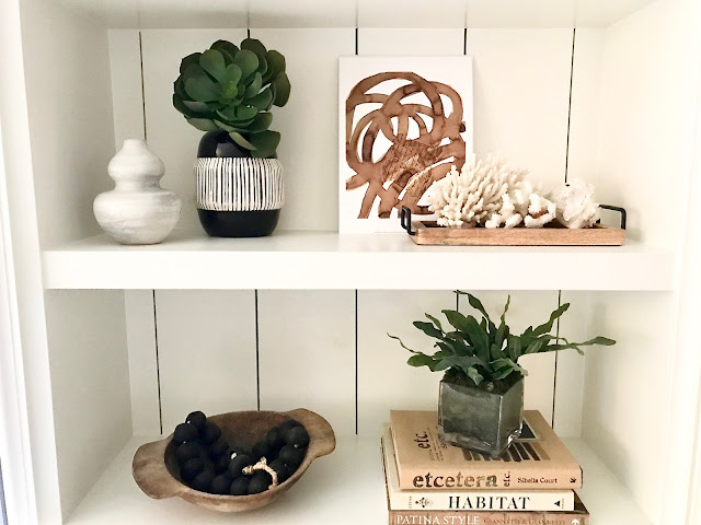
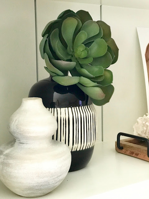
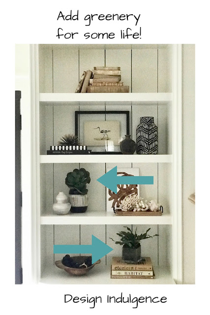
The top shelf has a cool black and white vase that I scored at Target last year....On the second shelf... both vases are from Target and I threw a green faux succulent in one of them [Pottery Barn].
Vintage wood bowl from a flea market.
I think for me....I like to add some vintage objects so it doesn't look like I just filled up my cart at HomeGoods.....you know? Believe me....I scoured my house looking for things.....
The wood shelf was found in the bath section at HomeGoods....thinking outside the box a little.....and the art was from West Elm painted by Steve McKenzie.
I kind of left the top shelf very minimal.....
Second side......
Before
Keeping mostly with black, white and some wood tones....
I wanted to mix it up a little so I moved the wood beads to this side.....
Again I like to add some greenery and try to find some that looks as real as I can....not always easy!
For the top shelf on the left....the vase was from World Market [bought last year]....dried flowers from an arrangement and some wood beads just curled up. I needed a small black painting so I did it myself:)
Tribal basket with faux plant in it....again put things into things:) I also added another small painting from West Elm by Steve McKenzie.
Remember....layering from behind with a small piece of art....or a book....or a sea fan....just something that will give it dimension.
And.......that's a wrap for this Project Design series! Head over to see what all of my other talented friends did.
Hope this gave y'all some direction and ideas....now you can get to work on those spring bookcases.....and remember have a sponge and some paper towels nearby.....just saying.
Shaywornout


