AROUND THE HOUSE


Good morning Monday....I have an Olympic hangover.......

Need to take a break today.....Sports are fun to watch and all that.....but well....gotta have some balance right?

It seems like you guys were all over that staging project.  I have more news to report...the professional pictures that the owner took and other details about the house.

Later on this week.

First up today I am going to share with you a picture of the slipcover  for my sofa that I did back in May...... and the dirt cheap lamps that I purchased at the Currey and Co warehouse lampapalooza.

This image was photographed by Christina Wedge.
She made it look pretty huh?


I took this one....
I have retired the pink chairs.


  I know...... it was a phase.  There was no other pink in my house and I just felt like they were a little disconnected.  A pink book maybe....

I am either gonna sell or have them recovered in a cream.  I dunno.
Thoughts?  They are modern.  I like that part.

I have something else to show you....
Remember when I put these hydrangea in this white vase....it looked so pretty I wanted to put fake ones in.  But....you guys blasted me about that.  

I really wasn't gonna do it.

I did find a solution though.

Tillandsia.

This little sucker needs no dirt.  Water like once a month.  Can I get a "hallelujah".

Just pick it up and spray the roots, or let it sit in a vase of water overnight.  

Might be the best plant ever.

I love it so much I might make some earrings out of them.....


Christina took this also.  She made me look younger that I really do.  I hate having my picture taken.  So awkward.  

I gotta run...Wednesday....part 6 of the ORC.  Hopefully I will have a few tricks up my skirt :)

 Seekers Bazaar did a sweet little post on the ORC.....check it out.
She gave me a new name....

Sherrific!  

BOOM.


44

HOUSE STAGING


We all know that to sell a house in this market is tough.  You really have to appeal to the emotional side of the buyer.....which is when people found out that a nicely decorated home would sell quicker.  That....and clean closets, clean basements, garages....and a good de-clutter!

My friend called the the other day and said that I HAD to come see a home in my neighborhood that had just been staged to sell.

This home had been a rental for 15 years.  It was being sold as a "FSBO" or "for sale by owner" or "Fo' Shizzle My Nizzle"!

I also know the person who owns it and staged it as well [she lives in the neighborhood].   We both laughed at the mention of stopping for items that people put on the curb for trash!

Support group.

Here are some of the pictures I took when I got there....


This house was probably built in the late 40's.  Some of the things they did were add these great gutters....


New roof....and I love the dark gray trim with the red brick.  She told me they did everything in 2 weeks.


This is a small house.  By adding the mirror on the fireplace wall it really expanded the room.  Didn't fool me though.....All of these furnishings were either from her basement or thrift stores.


Thrift shop or not I was about to jump on these chairs.  Notice she just added a white platter on the tray.


Painted the tile surround white.
Threw a piece of marble on top of this cabinet and added mirror on the doors.


Painted these lamps white.....Old sofa...


Plastic chargers from the dollar store.  All smoke and mirrors....


In the dining room there was a small round table....when I say small....this is the only eating area.  The sofa looked so cute in there...but of course not really practical!


Original cabinets [1940's people].....painted...new knobs.  Then the mirrored backsplash...yep.  Blind them with bling!  She did put in new granite countertops and sink.
  
Cute bath.  Notice 2 mirrors...just to help make the space seem larger.  She hung the shower curtain to the ceiling and I think that chandelier is from Ikea.


One of the 3 bedrooms.


This was a little area off the "master" upstairs.  They left the floors natural.  Now I have to be honest.  If you were a little drunk tipsy....it would be hard to get up these steep and narrow stairs.  But hey...it was decorated so cute that you might not think of that.


Curtain finials used for door knobs.


Same room....exposed brick wall.


Small alcove in the master upstairs.  Like I could put my makeup on there.....where is the 10X magnifying mirror?


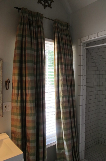
Silk curtains in the master bath......


This is how she staged the backyard.....


People...there is not even a driveway to this house [only street parking].  Including the master upstairs it is a 3/2.  The only living and dining space are the ones I showed you.  The kitchen is the size of a postage stamp.  In my opinion is was a tad over priced.


The first thing I noticed is where can I put my TV...priorities right?


Well I am here to tell you it sold in ONE day.  Uh Huh.  I was shocked.  But it just goes to show you that sometimes charming will wow them.....


It reminds me of when I bought my first house.  I was 25 years old.  It was a townhouse AND it was the model.  I was also blinded and did not even negotiate.....then they took all of the pretty stuff out.


Crikey it was ugly.


I am not really sure what the moral of this post is.....


Hey remember the RL fabric that I am using in the ORC???  I found a picture where they used it on chairs.
  
Die.


It came today and I have had it in every room of my house....just to see if it would work.


Of course those beautiful dark walls are killing me also.


And you guys have to remind me to tell my "croc" story.....it is pretty damn funny.


Hope your weekend is the shizzle.


Sheriky


44

ONE ROOM CHALLENGE WEEK 5


Here we are.....week 5 of the ORC.  I know everyone else has already posted...all of those "organized people" whose list have list.

 I thought I would have a big goose egg for you today....ha ha....I managed to round up a few things.  Whew.  I am like dang David Copperfield.

Last week we locked in with decisions on the fabrics.  That is where the first news flash is.  


We had picked out the Lee Jofa brown for the lumbar pillows in the club chairs.

Alert.....she changed her mind!!!  We revisited the RL brown zebra and decided that it would add a little more interest to the room if we were to throw it into the mix.

I totally agreed.......telling here if it was my room that is what I would go with.

Refresh.


I have to tell you it's out of the box for her...so you guys build it up  OK?  AND if you don't like it...well....keep it to yourself :)  Cause you know design is subjective and we all have different taste. 


Lesson for the day:  Always be nice.  ABN. 


As a designer I might not love the style of a particular room [like a really modern one] but I can totally appreciate a well thought out space that is pulled together and cohesive.

The next thing we made a decision about was the coffee table.
Here she be.  We are going to have it painted a light blue kind of like this finish.


The talented and sweet Kristin F. Davis will be working her magic.  AND...she graciously squeezed us in next week.  If you are not familiar with her work....
How cool is this...


Love how she matched the stripes to the shower curtain....it's all about the details right?


Love these stenciled walls.


So I know we will be in good hands.


Once the coffee table is done we are going to add this large basket from PB.  It will help fill the space underneath, add texture and she can put books and magazines in it.


A pair of cream lamps have been ordered from Ballard's.
But we are changing the shades to add more texture.


Plus...change out the finial to something like this.


Just to give it a little interest.


There you have it.  Fabrics have been ordered.  The train has left the station....


Now you can spend the rest of the day catching up on all of the other updates!


Lauren - The Cottage Mix
Lindsay - Everything LEB
Barbara - Hodge:Podge
Tiffany - Living Savvy
Jessie - Mix & Chic
Danylle - Nana Moon
Jennifer - The Pink Pagoda
Emily - Rue de Emily
Lindsay - Sadie + Stella
In fact I think I will take my ipad, go get a pedicure and start reading.  Every time I run....about three months later I lose the same toe nail.  So they have to paint the skin.  Weird huh?


While I was at PB today getting the basket and shades I took a few pictures.
Kind of digging this "old" trunk used for a coffee table.  Old meaning reproduction of course.


I have to tell you...this shade looks too small for this lamp...to me anyway.  Thoughts?


OK....I don't want to confuse the ORC with a post on PB so we will leave it at that.


Off for some pampering.


Sha Magic Girl!


28

RODOLFO CASTRO ARCHITECT


I got a call the other day from a client about doing a little updating in their dining room.  I helped with their remodel 2007 and it was published in Remodel Magazine [Better Homes and Gardens special interest publication].


Of course a few things have changed since then like a new baby.... which calls  a little more space.  


 This was at least 6 years ago and a many changes have already been made.  She had the whole house painted a soft white and recovered everything in light colors.


We started talking about the DR and then she mentioned that maybe it would be nice to have a little bigger deck.  You mean larger than 3 boards?  Right now it is about 4 by 4.  


Oh boy....that got me going and the next thing she knew I was talking huge screened in porch....fireplace.....flat screen to watch college football......garage underneath.....


Yup.  I can spend your money people.


I know when I left...fluffing up the DR was the least of her thoughts.


This brings me to architects.  Before Pinterest.....there was Houzz. I discovered Rodolfo one day and was amazed at his gorgeous work.  [file away someday when I win lottery and can put second story on and make my neighbors backyard look like the ghetto].  I can be mean like that.


After thinking about it for a couple of days, I told her that I thought we might need an architect to help blend this "little" project with the house [and make sure that it is done right!]


I knew just who to call.


Check out some of his work.
Uh huh.


Castro Design Studio is a boutique Residential Design firm here in Atlanta.


Gorgeous.


Nice hallway people.


One hot damn kitchen.


Another monster.


Now check out some of the outdoor spaces that really rocked my world.
Are you feeling it now?


Those shutters flipped me out...love and want.
 You why we got so excited?


When we met with him..... all "idea hell" breaks loose.  New window in DR.....garage...mud room.....whoa.....snap back jack.


Yup.  


You all know how easy it is to get caught up in "fantasyland".


Anyway....we got him working on it and I am thrilled to be involved on this project.


AND the DR is still on the boards so I will keep you updated on all thoughts and decisions.


Tomorrow is part 5 of One Room Challenge.  Lord I will be pulling something out of my ass.....head down and swim....but I won't leave you hanging.


Sherika


24
Back to Top