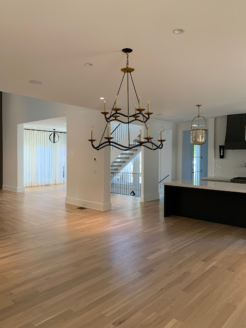
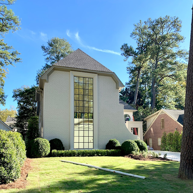
Today I am showing you the rest of the latest project that I have just finished working on with Ladisic Fine Homes.....I showed you the curtain install and the kitchen already.....
This home looks big but actually all the living will happen on the first floor. There are 3 bedrooms/3 baths upstairs with a small loft over the foyer.
Here are some pics to scroll through while you are drinking your coffee....
When you walk into the foyer from this pretty iron front door you can pretty much see straight through to the back yard and the pool. There is one living area, a bar, one dining area, powder room, laundry room, kitchen and master bedroom and bath on the first floor.
This pretty Circa lighting sconce lights the way upstairs....
This is the amazing loft upstairs and if this was my house :) I would make this my office! It gets so much light with all of the windows!
This shot from the top of the loft looking down to the foyer....
This is one of the bathrooms upstairs. I ordered the vanity from Wayfair and the lights are from Generation Lighting [a division of Circa Lighting]
This is standing in the dining area looking toward the foyer....
This is the bar area....
Here you can see the dining room, kitchen and foyer.
The powder room is chugging along....I am in love with this Schumacher wallpaper....the Serena and Lily mirror and the Native Trails sink. Still waiting on the un-lacquered brass faucet and light fixture!
I had a great time in Athens, Georgia last weekend! What is better than spending time with family???
The wedding was beautiful....I mean is there an ugly wedding....haha.
All outside so that made it even better and the weather was perfection!
I had to take all my OOTD shots in the lobby bathroom....I'm nothing if not classy....hee haw.
I bought the purse a while back from Nordstroms [it appears no longer available]
I swear it makes me smile when I can get away with 30.00 shoes that don't hurt my feet!
OK kiddos......busy day so I gotta get to the gym.
Y'all are the best....in case I don't tell you often enough:)
Shayrika


9 comments
The beauty, wow.
Thanks for sharing.
I love your work, but think this project points out the need for architectural review boards to keep the character of established neighborhoods. This house is a hulking monstrosity that appears to tower over its neighbors without regard for community. I live in an older neighborhood in an affluent community and experience daily the jarring sight of these behemoths in once-charming neighborhoods. Just because we can doesn't mean we should.
Beautiful work. Loved the dress -- and of course, the $30 shoes!! I think you should always include your OOTD (because you have so much free time) along with your design work. Please.. . 😀
interesting comment by unknown. not your issue/responsibility, you just added your magic.
anyways, smashing as usual!
Debra
Love your work! Wish you lived closer! I need help! Love your outfit outfit! Not sure what you mean about the dress not looking good in the photo and I have a very critical eye. Already looking forward to your Friday post 😋
It is a lovely home and I love your choices. But I have to admit, I had the same reaction as Unknown. To quote Gil Schafer, "How a site is handled is critical for framing the architectural character of a house and making it feel as if it’s always been there, while the interior decoration of a house enhances the architecture from the inside out."
Is the scale of this house really the right choice for the lot or the neighborhood?
Beautiful work, Sherry. How did the builder finish out the 2nd floor floor joists/platform that is showing in the 2-story garage window? I'd be interested to know how that was worked around.
As far as the other comments about the appropriateness of the design - unless y'all know something I don't - you can't really tell much about the neighborhood except for the house next door. There may be 10 other houses in the neighborhood already remodeled/new builds that inform the architecture of this house. (Full disclosure - I live in ATL too and generally know the area Ladisic builds in - trust me, these houses are gorgeous and appropriate for their neighborhoods)
Change is sometimes hard to swallow but it is inevitable. Better to let the change come from builders with integrity who hire seasoned, talented architects than flippers that turn a cute 1960s ranch into a god-awful, open concept white & gray box with no character or personality.
I agree with the others that the house doesn't belong in its spot; that is based on what I can see on both sides. It has nothing to do with Sherry's work, it is just an observation. The house can be hideous and she can still do a good job inside.
Neighborhoods grow and change over time. I say this as a fan of older neighborhoods. I grew up in them. I love them. They do, however, have limitations. The reality is, people want large houses (which have large closets, hallways and bedrooms) now than they did in the 1930s and 1940s. Just like the size of houses became smaller in the post WWI-1970s time frame, the houses built BEFORE that time were comparatively larger (1870s-1920). Housing sizes are an evolution.
The other alternative is for the affluent homeowners, desiring larger houses (closets, hallways, pantries, garages, etc) to leave the beautiful urban neighborhoods for suburban developments. Then we get urban blight and sprawl, long commutes, etc. THAT doesn't seem better!
Post a Comment