I can't believe how much better I feel since I got a little sunshine! Even though it was really cold last weekend....that was fine by me!
Let me say....dealing with the home building side of design is a lot of work. As I said before practically every project I am working on right now is coming out of the ground. I know many of you realize all the details that have to be decided....because most of those need to be made before the drywall. Plumbing, lighting.....and walls!
I have 6 of these bad boys going on at the same time. Can you say overload:)
Meanwhile I also worked on this powder room for my neighbor.
Here is the before....well not quite. I can't find the picture of it with wallpaper but it was red and the space was very dark. Which in itself is not a bad thing in a powder room.....but it is important to have good lighting which this space did not.
What I want you to notice is how close to the toilet the custom vanity was. That is why the legs were designed that way.....so you wouldn't hit them when you sat down.
Here is the deal....yes the vanity was centered on the wall but it just wasn't functional.
So....I said let's ditch the whole shebang. And they agreed. And....instead of spending a gob of money on another custom sink [which we definitely kicked around for a while] I suggested a plain old pedestal sink.
With some WOW wallpaper.
Bye Bye sink. And....let's just move that bad boy over to the right 6". Of course that meant moving the plumbing and lighting but for real it will be so much more practical.
We all agreed.
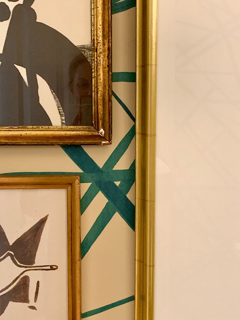
We went with the teal color of this Channels wallpaper because that is a color featured throughout the main floor of her house.
We used the Kohler Memoire sink and the Kohler Purist faucet. The lights are Circa Lighting.
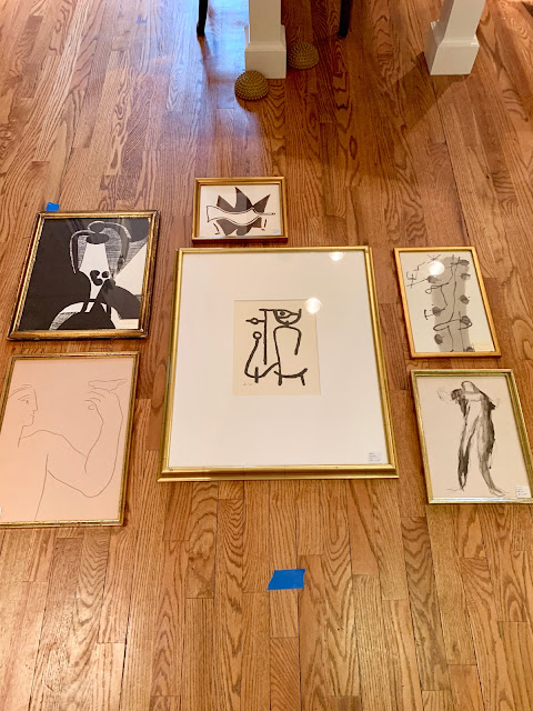
We set out looking for art. Now let me tell you....that was actually the hard part. She is an art historian. Verrrrrrrry Picky.
Then I dragged her up to a flea market that I visit often and to see this grouping. They are vintage lithographs in original frames.
She finally agreed right before I slapped her.
Whew.
Her kitty approved.
We saved back one to hang really low over this sweet little table I found to put a candle and vase on....
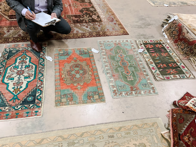
Next up rug. I wanted something that was colorful.
Took about six of them home to audition.
We went with this one....
The last picture will hang above the table at eye level when you are sitting on the "throne"....haha
There is one problem.....No room for a toilet paper holder. I'm stumped.....stay tuned.
And the cute table came....so of course now I need to accessorize adding a cute towel bar.....etc. I realize I do not have a full picture of the mirror. We found it at Foxgloves on Miami circle. It is a vintage gold shield mirror.
So....I have to get a final picture after it'a all purdy!
Alrighty then.
Coming Thursday is a Spring Fashion post with some of my favorite "over 50" bloggers. I am the oldest so I will be trying to look like a 16 year old just to prove I have no taste at all:)
***Deanna.... yes the ceilings are painted the same as the walls....when there are so many angles in a space I always do that to give it a seamless look!
Shaboomska
Let me say....dealing with the home building side of design is a lot of work. As I said before practically every project I am working on right now is coming out of the ground. I know many of you realize all the details that have to be decided....because most of those need to be made before the drywall. Plumbing, lighting.....and walls!
I have 6 of these bad boys going on at the same time. Can you say overload:)
Meanwhile I also worked on this powder room for my neighbor.
Here is the before....well not quite. I can't find the picture of it with wallpaper but it was red and the space was very dark. Which in itself is not a bad thing in a powder room.....but it is important to have good lighting which this space did not.
What I want you to notice is how close to the toilet the custom vanity was. That is why the legs were designed that way.....so you wouldn't hit them when you sat down.
Here is the deal....yes the vanity was centered on the wall but it just wasn't functional.
So....I said let's ditch the whole shebang. And they agreed. And....instead of spending a gob of money on another custom sink [which we definitely kicked around for a while] I suggested a plain old pedestal sink.
With some WOW wallpaper.
Bye Bye sink. And....let's just move that bad boy over to the right 6". Of course that meant moving the plumbing and lighting but for real it will be so much more practical.
We all agreed.
We went with the teal color of this Channels wallpaper because that is a color featured throughout the main floor of her house.
We used the Kohler Memoire sink and the Kohler Purist faucet. The lights are Circa Lighting.
We set out looking for art. Now let me tell you....that was actually the hard part. She is an art historian. Verrrrrrrry Picky.
Then I dragged her up to a flea market that I visit often and to see this grouping. They are vintage lithographs in original frames.
She finally agreed right before I slapped her.
Whew.
Her kitty approved.
We saved back one to hang really low over this sweet little table I found to put a candle and vase on....
Next up rug. I wanted something that was colorful.
Took about six of them home to audition.
We went with this one....
The last picture will hang above the table at eye level when you are sitting on the "throne"....haha
There is one problem.....No room for a toilet paper holder. I'm stumped.....stay tuned.
So....I have to get a final picture after it'a all purdy!
Alrighty then.
Coming Thursday is a Spring Fashion post with some of my favorite "over 50" bloggers. I am the oldest so I will be trying to look like a 16 year old just to prove I have no taste at all:)
***Deanna.... yes the ceilings are painted the same as the walls....when there are so many angles in a space I always do that to give it a seamless look!
Shaboomska


6 comments
Spectacular redo!!!
Beautiful! Would love to know your favorite flea markets, thrift stores, etc. You are truly talented!
Just where is this mysterious flea market, Missy? Beautiful job, as always.
ME TOO! what flea Sherry??
ok this is gobsmackingly good, again! kudos to you!
6 new builds? Did not know you maintained a staff, what?!?! keeping busy is great and with your creativity, cannot wait to see the results
xo
Debra
What a great transformation!!
Wow!!! This is a stellar transformation, Sherry!!! Congrats!!!
Post a Comment