Barbara Westbrook

I have admired her work and thought I would share a few pictures from her portfolio.  I LOVE the blue shutters she used in the family room picture!  Everything is so edited.
0

A few notes about styling.....

Just like fashion....a room needs to be styled.  You can put on the cute little black dress, but without the shoes, jewelry, the "fantastic purse", a jacket....it will look like every other black dress.  You need to make it your own by adding your style to it!  The before and after pictures show what a big difference adding accessories will make to your space.  Rug, pillows, curtains, and furniture placement will make a huge difference.  When Denise and start a job, we always take everything out of the room and start over.  Furniture first, then tables, lamps, wall art, pillows and table accessories last.  You will be surprised at how the room will come together, when you do it in that order.  It is then that we can begin to make a list of  things to help complete the room.  Shop the other rooms in your home.  Just moving furniture and accessories around can make you feel like you have a new room!!
0

Don't we LOVE West Elm....


Here are some of my favorite things from West Elm.  I could do a room around all of these!  The floor lamp is so cool and would add a contemporary element to any room.  And the rugs...love the yellow one.  Paint the walls a soft gray, and add some white bedding....love!  The wooden lamp could be painted white....The gray zebra rug....what's not to like.....Gray is so HOT right now....I need more rooms!
3

Springtastic!

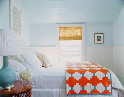
I love these rooms from Leslie Klotz.  These are my colors......because they make me feel like I am always at the beach...enjoy....
0

"Help, we need a bench in a hurry!"

Sometimes when we are doing projects,  after all the furniture has been ordered,  we still need something.  That is when we head to our favorite store Homegoods.  For this project the client decided that she wanted a bench at the foot of the bed.  After a few trips,  we left empty handed....but then we stumbled across this one.  It really was perfect, but we did not like the color of the legs or the fabric.  Not to worry.....a little black gel to the rescue.  Then some fabulous fabric, pewter nail heads, and perfect!
   
0

Neutral Bedrooms....


Don't get me wrong....I love color.  Really.  But every time I see a bedroom done in neutrals, it is so calming to me.  I don't think I would get tired of these rooms.  One is from West Elm, and I really can't remember where the other two came from, but enjoy.
0

Kitchen Renovation

I got a call about a year and a half ago from a new client wanting to update her house.  She had seen an article in a magazine that mentioned how we like to reuse and repurpose on our projects.  Her kitchen had not been updated since she had moved in 13 years ago.  It was very colorful as you can see in the before pictures.  She is an artist and really likes color, but we showed her that she can keep things neutral and add color with her art and fabrics instead.  Here are some before and after shots.  We had a new hood built over the cooktop, painted all the cabinets SW Creamy.  The walls were painted Farrow and Ball: Pigeon.  The island was painted Farrow and Ball: Mouse's Back [one of my favorite colors].  New appliances, new countertops, subway tile backsplash.  We took the old yellow kitchen table and added a new top, along with repainting the chairs and base.  After re-positioning the table and chairs to the bay window area....it really opened up the kitchen.  The upholstered high back couch is now one of her favorite places to sit.  Along with new light fixtures, new iron knobs, it is a much cleaner look.  We definitely saved money by not ripping out the cabinets, or getting a new dining set.  We still gave her some color, but a much calmer version.....Stay tuned for more pictures of other rooms we did.
0

Hotel Liquidation Outlet

Before.......

Desk before painting


0

Bed makeover.....


These 2 pictures show how easily you can re- dress a bed with ready made pillows and a duvet. One thing to notice is the grasscloth wallpaper behind the bed. It is only on one wall, which is a nice way to bring some texture and movement in a room. A less expensive alternative than doing the whole room. In the before picture notice how small the lamps are beside the bed. They look dwarfed next to the scale of a king size bed. If you can't buy new lighting, another way to make them seem larger is to place 2 or 3 books underneath. Also, maybe change out the shades for a more modern look. We added some art above the bedside tables to layer and add more texture and color to the room. With a little effort in one day, we created a softer and more visually pleasing view.
1

Speaking of makeovers.....


Are you starting to see a theme here! I get so excited to see the "after" of a makeover! It is like a drug....so I just want more.....Here is a table that got an especially cute makeover with paint, and a zinc top! I mean really...don't you wish it was yours?
0

Here is another before and after.......


OK...here is the before! It had become a junk room and she wanted it to be a guest room! Very small budget...almost impossible I thought, but thanks to Homegoods, Target, and Ikea it came together! We made the headboard from a curtain panel from IKEA....Everything else was ready made, except for the cute paisley pillow on the bed. That was made from a scrape of fabric that I had left over from another job. The room was painted and we sewed black trim on the 2 pillow shams. Here is another tip...trims are a whole lot less expensive at Hancocks and JoAnnes. Especially if you just need a solid to enhance something. Don't rule out just plain gross grain ribbon. The pictures were scrapbooking sheets that were about .50 each. The frames are from IKEA and we all know how budget friendly that place is! The curtains were from JC Penny and practically free....as was the bamboo shade from a close out at Bed Bath and Beyond. You know....you really do not have to spend a lot to get a cute look. 25 years ago...people decorated their homes and left it that way forever! Now, it is almost like fashion...design styles change a whole lot quicker.....and when you tire of it, you don't feel bad starting over! I really do think the trend is going away from over spending. Recycle, repurpose, and reuse! Be "green"......
0

Chair Makeover


OK.....I have to give credit to Eddie Ross for this makeover. I believe he was on Top Design. How many times have we seen these chairs at Flea Markets or yard sales? I thought this was an awesome idea. I have also included another picture of a clever chair makeover. Old wood chairs can come to life with a great coat of paint, trim, nail heads and some wonderful fabric. You only need about 1/2 yd for this project. Very easy to do with a staple gun and some foam.
0
Back to Top