A NEW SLIPCOVER


Thank you all so much for those wonderful comments on the bedroom makeover!  Sometimes I AM  even amazed how good a room will turn out when I have a small budget. 

 I have seen it proved over and over again out in blogland that "Necessity is the mother of invention" with so many wonderful projects created when they had to watch how the money was spent.

A while back I posted this picture on Instagram [sherryhdesigns]


Yup.....even though I do love the stripe....it was only a matter of time before this baby would get her white slip.

I called my favorite guy Jim and told him to pack up his machine and come on....


The stripe will still be around cause it is pretty versatile....


She can take a variety  of pillows.....with no complaining.


And go from a winter to summer look with the change of a pillow.


So he got to work.....pinning and cutting.

I decided on no cording...I like my slipcovers to be kind of simple.

And....in no time at all it went from this

To this...


Of course she is really a "ho" as she demands a different pillow on a regular basis.  In fact I was having a conversation with a friend of mine the other day.....she was telling me a story....and during that 15 minutes I changed out 5 pillows in my den from my "stash".  

On a whim.

And got inspired all over again....to make a few changes at "Chez Sherika"

So that is how it goes around here....."mad scientist"...."mad designer"  what is the difference.

Last night my husband and I celebrated our 20th anniversary at Bacchanalia

 My first time there.

Wowza....the presentation of the food was..... for lack of a better word.....incredible.


And since I am not a food critic.....I can not even begin to describe how it tasted.

 But "Foodgasim" comes to mind.


There were 5 courses and a wine pairing with each.

And no less that 10 different people tending to your every need.

Give it a try.  You won't be disappointed.


Have a nice and relaxing Sunday. 

I don't think it is going to rain in Atlanta today.....we'll see about that. 

Shacraycray


32

BEDROOM MAKEOVER....THE WHOLE STORY


OK....where were we before my mean streak occurred and I left you guys hanging.

Oh yeah....the guest bedroom makeover.

Here is a before

My suggestion was to move this console that holds the TV to the wall at the foot of the bed.
  
2 reasons. 

It is not doing the mirror any justice and it is hard to see the TV from this angle.  By the way she got the mirror at Ballard.

You already know [from the previous post] that her Mom had this chest....which was painted along with adding those pretty crystal knobs from Anthro.
Honestly what is better than paint?  It is so damn transforming.

Here is a picture of the lamp from Homegoods when I bought it.


I could see the cuteness....but I think changing out the shade made a big difference.  I used my favorite one from Pottery Barn.


Those adorable books came from Anthro...the basket tray from World Market.  The shell from Goodwill along with the glass vase that has the flowers.  The frame from Target with a picture from a brochure I had.  


She had the baskets that I put underneath and the jar is from Target.

Here is the wall in front of the bed.  Since curtains were out of the budget at this time I had her take the rod down.  We can always add those at a later time.


Here I added a small 5 x 7 rug for softness along with the metal baskets.  She got the console at Scott's.  

You can see I removed the smaller glass jar.  I always edit a room at the end after I take a few pictures and look at them.  My thought is less is better.  The large glass adds a different element from the metal baskets or the seagrass trays under the chest.  Plus when she is having guest it's easy to clip a branch for some softness.

   A better shot of the whole space.  I was going crazy trying to figure out what to put on the wall to the left of the console.  I had nothing left!  Then I remembered that she had this covered cork board which could be a nice place to  put pictures of your guest when they visit...or a list of activities you have planned for them.  I used some command strips to hold it n place.

Here is the corner where the Kubu chair from World Market is.  I tried to find a link on the web site.  I know that they were discontinued  for a while but I was told they are back in stock after some production issues.

This was a pretty lonely corner.  It called for some pattern in the form of the pillow and art.  I ordered the prints from Etsy.....Linda Donahue and the pillow also from Etsy....Pillow Talk and More.  


Again....I am digging these frames from Target.


And now the wall with the bed.  Like I said the only big change here was the pedestal stand on the left was painted the same color as the chest.  And of course that bed needed some party clothes!!


Here is the repainted stand.

I found that acrylic frame from Goodwill!


Here is a before of the nightstand.

Raising the lamp with a few books that I scored at a flea market helps to give it more presence.  I also found those old National Geographic magazines which I put in a metal basket from Homegoods.  I used a piece of marbleized paper in a target frame and of course fresh flowers always help:)


And thats it!  Thanks to my client for letting me document this process:)

OK....who's next?

I heard on the news the other day that it has rained 22 out of 24 days in July.  

Whoa baby.

Shazam.....it's already Wednesday!


52

BEDROOM MAKEOVER...THE BEGINNING


OK.....where to start.

I could just show a before and after picture and be done with it.....but you guys seem to like the process.  I am kind of like that also.

 I want to know why decisions are being made.

Of course as I have said before there are many factors that affect the plan. 

 Correct me if I'm wrong but time and budget are the biggest right?

When I got a call about this guest bedroom makeover she had already purchased bedding, bedside lamps, a Kubu chair, and a mirror along with painting the room.  She and her husband also diy'ed a headboard!

Being a working Mom with a young baby I think she felt overwhelmed to get it pulled together before company in a little over 3 weeks.

Sherika to the rescue.  It was also a plus that they eat at my sisters restaurant Nancy G's Cafe.  

Here is the paint color BM White Sand 


And here is the fabric used for the headboard.


This is where we started.  

We discussed changing things out but with so little time I thought the best plan was to enhance what was already started.  Let's move forward.

I wanted to paint the pedestal table on the left along with a dresser she got from her Mom the same color to bring some continuity into the space.


I chose BM Galveston Gray

It was close to the gray in the headboard and since the room was small I wanted the eye to have some places to rest.

When I first toured her home I noticed that she liked soft neutral colors...and maybe she mentioned that she was not a big fan of black and dark colors.

Whatev.....let me force you out of that box.

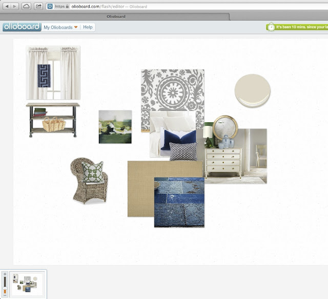
Here is a board that I put together for her.....using navy, green and white.

After I sent it I waited for the phone to ring with her proclaiming what a genius I was.  

Me:  "Hello".  In a light sing songy voice.
Her: "Sherry this is perfect and I am ready to jump out of that box into this brilliant plan."

What I got was this.... 
Her: "Meh".  "Not so much".  
Me: "WHAT?"  
Her: "Yeah...what part of dark colors and black did you not hear?"

Me: "Yeah but".....
Her: "NO".

Dang.  Plus maybe this one was going to be a tiny bit over the budget.  Budget smudget.  I hate clients who work in finance.   

OK....that is the good thing about design...there is always door number 2.


I sent her this picture....Ah....love.

Great we have a winner.  I can work with this.

Now here is where you are going to want to punch me in the face. 
 I am going to show you the painted chest and then save the rest until the next post.


Isn't she a beauty now?

Go ahead and cuss me....then come back on Wednesday for the reveal.

Shasneakygirl....


29
Back to Top