Darn....I totally forgot to post about my trip to Nashville to see the House Beautiful Whole Home Project. Do y'all remember when I participated in it last year here in Atlanta? Well this year they had many designers participate and it is actually a showhouse. Last year it was only open 2 days.
I drove down with Ladisic Fine Homes....I always forget how close Nashville is to Atlanta and what an easy drive it is.
Get some coffee or wine cause this one is long:)
Last year the house had a farmhouse feel this one didn't....it was built by Castle Homes and located in the Belle Meade area.
The foyer and living room were done by Vern Yip.
I loved the arched iron doors in the entry.
My picture of the foyer above and the professional one below.
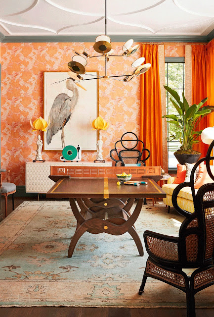
Off the entry was the dining room with a table that converted to a ping pong table. This room was designed by Chenault James.
I did love that vintage curved sofa....so "Mad Men"
Ceiling....yes please
Gorgeous rug....
Matthew Quinns kitchen which was incredible....
I bet they had an easier time getting this dog to model than I did with Cami last year.....#nothavingit #highmaintenance
This hardware and loved the Caesarstone Excava quartz countertops....
The butlers pantry also designed by Matthew....
This cool mesh by Architectural Grill
I loved this color.....not sure what it is but maybe you can find out online.
Across from the kitchen was the family room by Vern Yip
It went nicely with the kitchen.
Through the butlers pantry is the laundry/mudroom area by Castle Homes.
Crappy picture but the backsplash was this yummy shade of blue!
The kitchen dining area by Modern Remains.
The colors below were actually more accurate....I took this one.
Here is one I took.....
The master bedroom by Jackson Paige Interiors
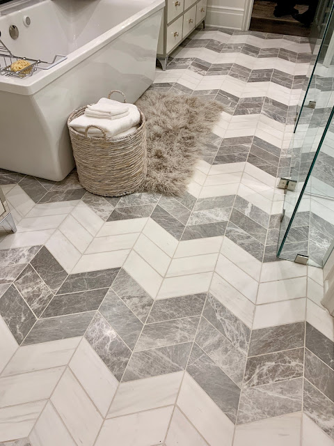
And the master bath by Matthew Quinn
Very pretty!
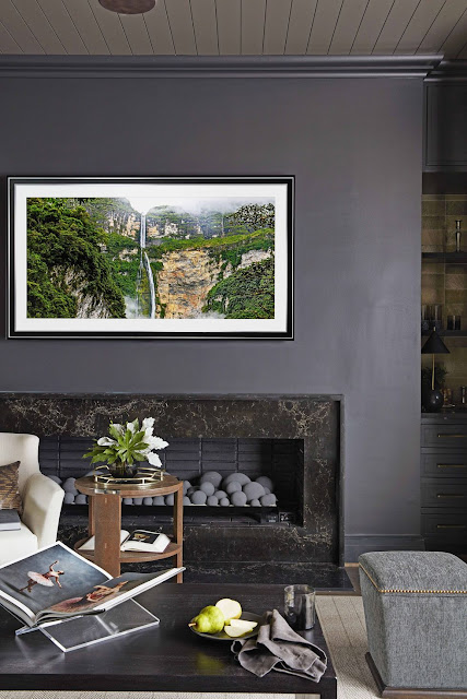
Upstairs the media room by Modern Remains was my favorite....dark and moody!
They also did this space which was at the top of the stairs before you went into the media room and 2 bedrooms....
They were busy with 3 spaces total. But....I have them beat as I did the whole house last year and it about killed me!
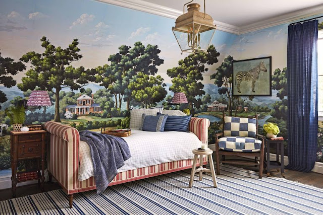
Both of the kids rooms were by Amy Berry.
Barclay Buttera designed the outdoor space.....
That umbrella!
A few pictures of my trip.....
What I wore to the party that night.....duh #blackandwhite
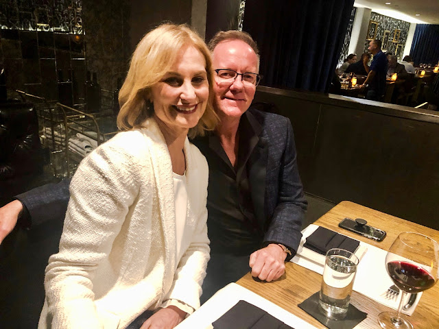
Ric Parrish and I at dinner with the Architectural Grill company. Y'all the reservations were for 9:30....uh huh. I didn't think I would make it [you know early bird special and all] but I rallied. We left there at midnight....I was entertained so it was easy!
So look....if you are a designer in Nashville you will be excited to know about the NDC opening up! Ric and Matthew gave us the tour....
So excited for them!
Walked around Nashville the next day and had lunch at this cute spot....
Then a quick drink with Michael and Lisa's daughter who is attending Vanderbilt.
#twins right!
I wore the same jacket to dinner that night with a J Crew blouse and my favorite AG jeans.
Before we left the next morning we had brunch at Pinewood Social.
Which is a restaurant with a bowling alley in it!
And that's it! One of my longer post but you can skip the banter and just scroll thru the pictures....or pick up this months HB and check it out on your own.
I'll be back to my regular "what the heck should I post about".....posts on Friday :)
Again....I so appreciate everyone of you who have commented and reached out to me.
Shablessed












11 comments
Love,love that kitchen. Everything else in the showhouse made my eyes hurt. Sorry. :(
The kitchen was ok, yuck to the rest. It was a disjointed mess.
Just want to say you look fabulous! WTG
I thought the house was fabulous and I'm glad you got to see it. I don't understand putting up that beautiful mural and then sticking furniture in front of it and even hanging that zebra picture on it - weird! Sounds like you had a good time and got out of your routine.
dear roving reporter, fun, not only the house but the Nashville destinations!
Debra
ps.....looking fab! xo
I liked your house much better! But then I liked House Beautiful much better back then too.
You look soooo fabulous!
I must agree, I do not get the designers. It did look like a disjointed mess. I couldn't live there. The same feelings I had with this month's HB mag. But I don't care for mid-century & the 60s look.xo
You look wonderful! Thx for the fun read and "house porn" as I drank my coffee this dark, cold CT morning. About to head out with my doggies for a spin through the neighborhood but wanted to comment and send love and strength and good thoughts and vibes to you. Thinking of you!
You are looking gorgeous!
Loved this post - lot's of eye candy.
Wow! It looks like the designers tried to see how much "stuff" and how many colors they could cram into one house! Was there no communications before they started work? Your house was so much better!
There was a backsplash in the Dark room where they had the bar set up ( it’s a brown gold tone can you tell me where it’s from?
Post a Comment