Well.....well....well! Somebody is actually reading my blog! You guys were commenting like it was 2014:)
I am so proud of this project and could not be happier that it was published in Southern Homes. It was a perfect fit for their Before and After issue.
Just to review...... my clients had lived in this house for over 20 years and raised their 3 children there. It is in a great location and after looking for a new house [with no luck] they decided to do the renovation.
After it was all done there was not one inch that wasn't updated including the whole unbuilt space downstairs adding a bedroom, bath, office another family room, sitting area, 1/2 bath, and gym!
So....today I am showing you the living room/dining room which were 2 rooms before and now have been opened up to one large space.
Right behind the kitchen was the DR
After.....
Before
2 doorways were added into the kitchen/family room. The bookcases were also taken out.
She opted for a more casual space and the Charles Stewart dining chairs are covered in performance fabric!
One of my favorite things is the makeover of the fireplace including the antique mirror over the mantel.
Circa Lighting chandelier
During....
Before of the living room
As you can see there were doors in-between the DR/LR. We also changed the windows and got rid of the arches for a more streamline look.
Love this Lee Jofa trim....which helped to define the white curtains from the white walls.....Benjamin Moore White Dove
After.....same direction view. Circa Lighting fixtures
All upholstery is Charles Stewart. Paint color Benjamin Moore White Dove.
This became a long room and I wanted to add some of the bookcases back for texture.
Before
During
I decided to frame them around the sofa.
As I said in the first post we re-used most of the clients art which had been collected over the years from their travels.....
You can see here it is all one space now....
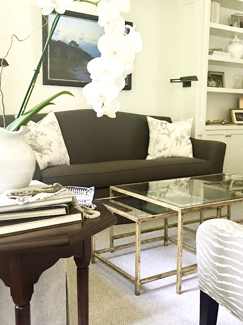
I think this was the day I found this awesome coffee table from Bungalow Classic.
It was perfect for the space.
I really tried to give her a classic look....something that would stand the test of time....using as many of her accessories and such as I could so it would feel like home.
Architect: Linda Macarthur
Builder: Michael Ladisic
I managed to make it through the week without any incidents.....meaning no change of clothes in the middle of the day....hahaha
I did do something stupid like wear new shoes to the Mart one day and now I am sporting ugly blisters on both of my heels....which limits my shoe wearing at this time.
Crikey it's always something.
OK.....here are the three subscriptions! Please email me with your address!
Regina S. said...
Architect: Linda Macarthur
Builder: Michael Ladisic
I managed to make it through the week without any incidents.....meaning no change of clothes in the middle of the day....hahaha
I did do something stupid like wear new shoes to the Mart one day and now I am sporting ugly blisters on both of my heels....which limits my shoe wearing at this time.
Crikey it's always something.
OK.....here are the three subscriptions! Please email me with your address!
Oh my gosh this made my morning! I love how real you are! Love everything on this reno. I would love to read this magazine!
I love everything about this house that we see so far. Will we get to see the rest?
Bless your heart, haven't we all been there at one time in our lives! 😂Love your honesty and love everything you design. Keep it up!!!


21 comments
This reno is perfection. Period. ❤️
Incredible. The dining room is fantastic. Love the two new openings. You’re so good!!
Gorgeous Sherri! Can you give the fabric info for the dark sofa? Love it. Also, met Sudi at the Mart and she (and her pillows) were fantastic! Thanks in advance.
just realized I was staring at the images, mouth open, drooling......hot damn girl! gorgeous!
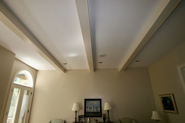
love the details everywhere including changing the direction of the beams
have to go back & stare again!
debra
I never comment but LOVE,LOVE, LOVE your blog, your work and your adventures!
You knocked it out of the park again! Love it all! I need to subscribe to "Southern Homes" too!
Just Beautiful! Love the Circa lighting fixtures -
I've followed you for a long time and have never commented but always love seeing your work. However, after seeing this home's transformation, I must chime in. It is absolutely incredible!!! Would never know this was the same house unless seeing these photos side by side. Everything about the new layout and style is perfection! The details are amazing and everything is just gorgeous!
The homeowners must be thrilled.
Wonderful transformation! Have you ever considered doing online consultations-you know in your spare time?!!
I love this! and in fact am going out to get that magazine just so that I can have these images around. Too bad you are so far from me (Canada)! Congratulations, wishing you much continued success.
Every inch of this “before and after” redo is perfection! You made their home very up to date but kept it classic to stand the test of time. I love all the changes, especially opening up the space and painting everything White Dove. It just gorgeous, great job!!
Damn, you are good! I love your blog and design work. I guess this is OK — I won, you said, so — I am Scribbler— my email is ellenshook@mac.com. Damn, this is fun!
I love your blog! I used to blog for 10 years, used to be a designer but retired. It is so much fun to watch what you do.
Ellen Shook ellenshook@mac.com
Huge fan of this - congrats on the feature! Do you have the source (or sell) those curtain rods? Love. Please let me know, thanks :)
I love this so much. The curtains are flat-out gorgeous. So unbelievably beautiful. This actually makes me feel better about spending so much money on custom curtains--they are totally worth it!
Just lovely, Sherry. I think the biggest compliment I can give you is that this home doesn't look...decorated. It looks fresh and traditional and warm and has so many pretty and thoughtful spaces. That dining room fireplace with the mirrors is just delightful. Well done Miss Sherry!
Oh my, you are so talented! I just love your work! I really like how you replaced the arches above the windows. They look so much better now. Congratulations! You should be very proud of your work. You are making the world a more beautiful place!
Your work is truly magazine worthy! How fortunate your clients were to have you on their renovation team. What a dream it would be to walk into these rooms each day! What color did you use in the back of the display shelves on each side of the dining room fireplace?
Phenomenal job Sherry- I love this so much and all of your structural changes! Beautiful!
Great job! Where did you get the round balls in the fireplace?
Thanks for sharing useful information.
Rugs online
It's really lovely but why did you remove the arched windows? They were beautiful!
Post a Comment