
I have been working on this project for about 6 months. Custom furniture always takes the longest.....and there is bound to be a little backordered curtain fabric thrown into the mix:)
But.....it is slowly coming together and I have a few tight shots to share with you today. If you want to read more about it you can go here.
The CR Laine spool chairs arrived and they are so pretty!


We used the Driftwood finish.

The garden stool from Wisteria fits nicely in between them.
Before


After
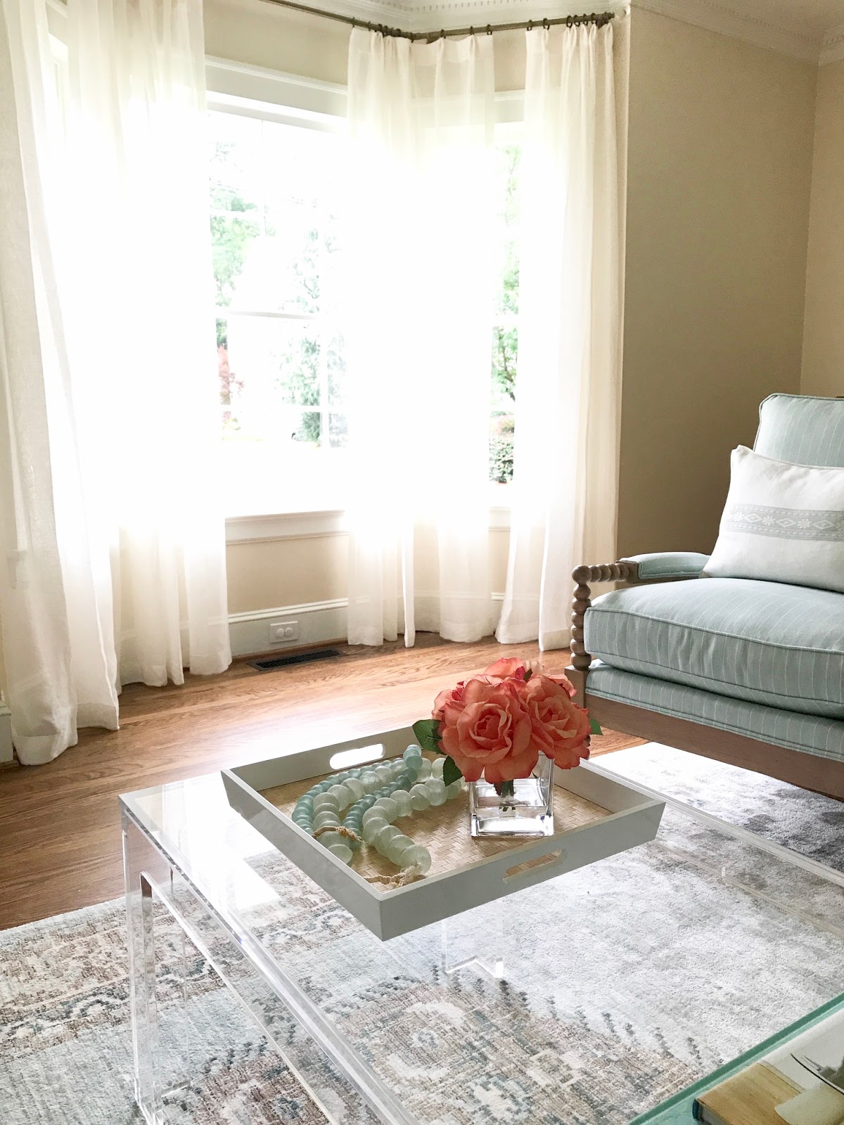
The curtains were also hung and of course that is always a game changer right....along with the Ballard acrylic coffee table.


The Charles Stewart sofa made it's debut and I am always amazed at the superior quality of their furniture. I used a performance fabric called Crypton....and while it is considered a workhorse I would not recommend just smearing mustard on it!
Before

After
Before

After


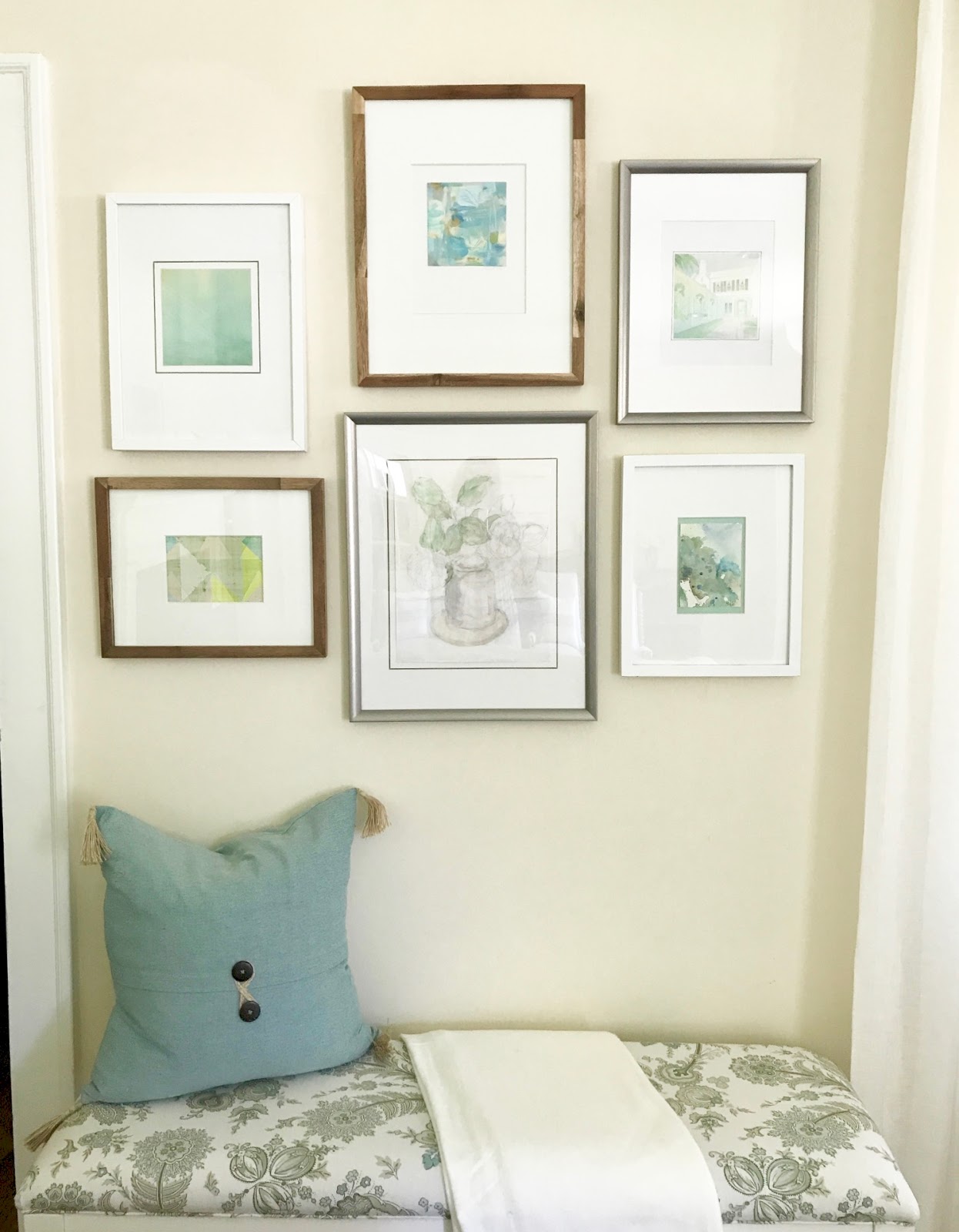
A small gallery wall was hung over the bench behind the sofa.....

The armoire was finally removed and and the piano in place.....
Before
Before

Which leaves me another challenge....more art or something architectural?
After

Here are 3 in contention.....
#1.

#2

#3

Thinking a bit of punch in the room......Do you have a favorite?
#1.

#2

#3

Thinking a bit of punch in the room......Do you have a favorite?
Crikey there is a lot of wall space in this room:)
What plans do y'all have for the holiday? You will find me at Jury Duty on Monday. Yeah that sucks......but even more if I get picked. Somebody has a bad attitude.
Shaypouting

What plans do y'all have for the holiday? You will find me at Jury Duty on Monday. Yeah that sucks......but even more if I get picked. Somebody has a bad attitude.
Shaypouting


18 comments
Beautiful space. I think number two for the art, but whatever you choose will be perfect.
love no. 2, and your artistry!
debra
Lovely room! What is the wall color?
Love the soothing tones used in the room. My vote is for the second picture, but Z Gallerie has some awesome art in the aqua tones for summer.
I like #2, then #1. Beautiful room!
Everything is looking lovely. I like all three art choices, but my favorite is #2. Where are they from? I hope you don't get chosen for jury duty. While it is something we all should do at least once, sometimes the timing is too difficult.
Hands DOWN Number 2
def!!!
no question
in case you didnt hear the first time
NUMBER 2!!!!
I was going to say number 2, even before I read any comments :).
Beautiful room with lovely soft colors. I liked #2 right out of the gate, then the boldness of #3 really caught my eye as well. I know you will choose just the perfect piece, after all, You always do!!!
All of the art is beautiful but I like #1 from a design standpoint so that the art does not get too "matchy-matchy " with the decor. Rooms with art not in the colorway of the room are so much more interesting and layered.
Lovely design as usual. I like all of the art, but I feel like this room has a peaceful vibe so #1 is too colorful for me, #2 is lovely but matches too well, and #3 is just right. I am sure whatever you choose will look great. I enjoy your blog, it always brings a smile to my day and sometimes an LOL.
Lovely room and great palette, Sherry. You have mastered the art of the gallery wall too! Your clients must be thrilled with the results! xo
Holly
I really like #1 and #3.... but I love #2!
#1 or #3 will make for a much more interesting room. #2 is too similar to the rest of the space.
My pick is #3
My vote is for painting number two. I like the colors and balance.
What is the white color of the Crypton fabric you chose? Was it Salt? Natural? ???
Love painting #2.
lovely, soothing palette, Sherry. I love that you plan these spaces to be a refuge for your clients!
Post a Comment