
OK.....back to the KOTY. Farrow and Ball was one of the sponsors for the House Beautiful Kitchen of the Year.
Of course I had no problem picking colors because we all know how beautiful their range is.
Most paints start with a translucent base and add pigment. Farrow and Ball add a higher level of pigment which produces their depth of color....another reason that it's hard to color match with another company.

Let's start with Pavillion Gray....it's definitely a true gray similar to SW Repose Gray. No green or blue undertones.

Oval Room Blue is an incredible color.....After it went up I was in love with it's rich hue.
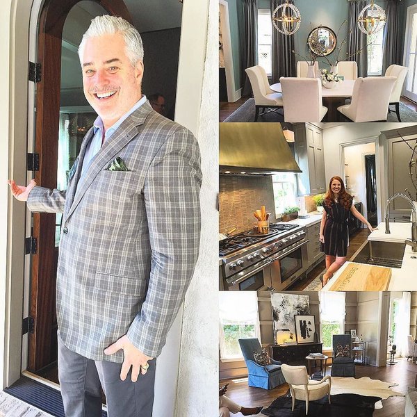
Dining room in the KOTY


Down Pipe is a dark gray with blue in it.....think industrial.


Farrow and Ball's All White is crisp and clean.....a true white. Below it is paired with Farrow and Ball Dovetail. Beautiful!

I kind of feel like I am the last person to discover Cornforth White and everyone is snickering. It's lighter that Pavillion Gray but again....a true gray.


Go here for a whole post written on this color with ton's of pictures.....
I met so many people that week but just fell in love with Sean Sullivan who is the Group Marketing Director and associate publisher of House Beautiful.
Sean is hilarious and writes a food blog called Spectacularly Delicious. People who know me are aware that I don't cook but I am all about pretty pictures of food and I like to eat food so 2 out of 3 isn't bad:)
I can't wait until October and the issue comes out!
I hope you guys are having a fantastic week....it's only June and already "Guam Hot" here in Atlanta.
Shasizzling


3 comments
Love those colors and seeing them in the rooms. :)
smashing! i too can't wait
debra
Such beautiful paint colors! Trust me, you're not the last to discover Cornforth White!!
xo
Holly
Post a Comment