
Morning y'all....it's Friday can I get an Amen?
I've got an interesting little ditty for you today.....check this out!
This room was photographed about 5 years ago for BH&G but they never used it [if you remember this was a guest room before it was "Baby G's" nursery. ]

Well I saw it in Better Homes and Gardens about a month ago talking about using yellow in a room.
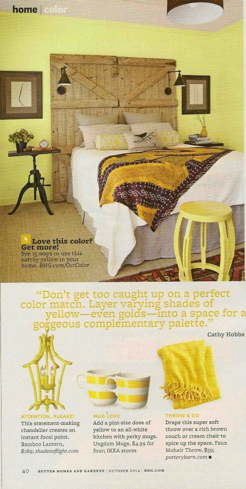
Amazing huh? They changed the wall color and the ceiling color with a little photoshop help.
Call me crazy but yikes I'm not exactly a fan. That is the worst yellow ever.
Here is how it looked when it was transformed into a nursery

I found this quite amusing.
In other news do y'all remember when I posted about some new design books?
Well I got Simplicity by Nancy Braithwaite and Lord....this is one beautiful book. It's like Nancy had me in mind when she designed the outside of this one.
Feast.
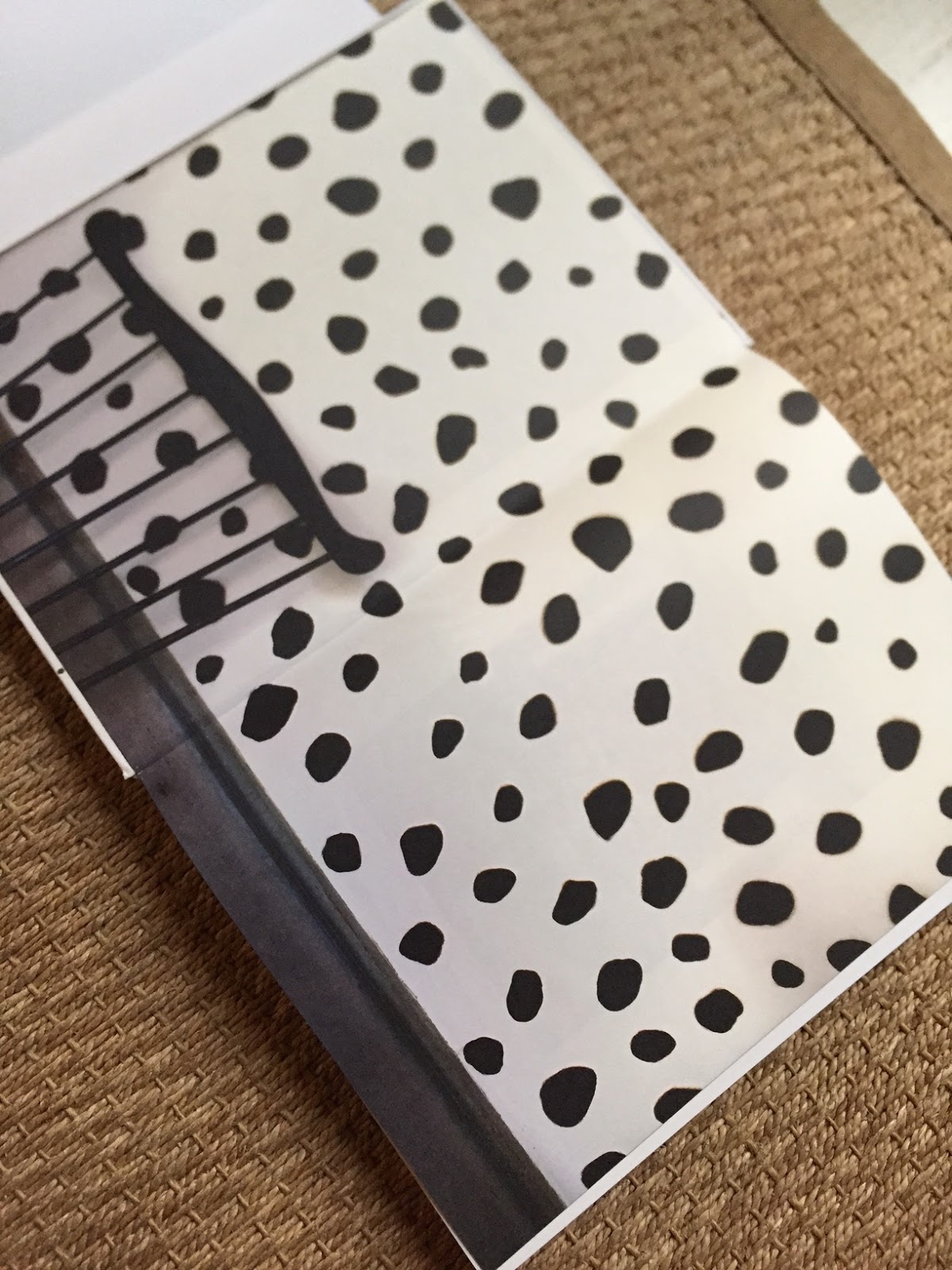
The inside cover....but wait....

The outside!

So when you have the cover on you see about an inch of the dots! Brilliant!

Every page is stunning....


But hold on....this bedroom kicked me in the gut....hard.

Can I just copy this somewhere. I mean down to every detail? So classic but just throw in the dots and it's all cray cray right! Imagine without them....just another beige room.
The pages.

Black.
Get it.
I will be working on my ORC this weekend. The days are starting to run together now......with only 288 hours until the reveal.
Sharunningonempty


20 comments
I'm with you on the yellow they photoshopped in. Your version is so much better!
The first image was one I saved (before Pinterest) in my decorating ideas file. It cracks me up because my style has evolved so much. I like the room as a nursery best. I think you are correct that the BH&G cover is the worst yellow ever.
oh my god. that book is haunting me. i need to get it now.
wait - YOU did that first room?!!? SO FUN. I kinda thought that might've been you with the baby, but I wasnt sure. If they were doing a piece on yellow, why wasnt the ceiling treatment sufficient?? That yellow was much more correct and confident that the pastel one they chose!
I can't believe that they...took liberties with image. AND I can't believe that they thought they're version looked good. Ugh. Yours is way better.
Some one should tell BH&G that they should lay off the photo shop! The original was great and much more chic. Love it as a nursery! Great job as always.
All I can is wow! Now, I wouldn't mind my wrinkles being photoshopped, but not a beautiful design such as that!
Oh boy, they wrecked your version. You did such a great job! I want that book!
Wow, who knew they would go so far as to color your walls! LOL! I like your version better! and I love and adore Nancy's awesome book. Added touch to have black and white dotted cover isn't it? Rah-dick-a-las I say! Happy Friday! Cheers!
Want. The. Book.
Have a great weekend!
Holly
Okay I just ordered it! Thanks for the preview...I have been dying to get it but just haven't taken the time! Totally agree about that nursery...yikes that yellow!!
I am visiting by way of Cindy, as for your room and their photoshopping, WHAT were they THINKING? They weren't ! This is the worst ink yellow I could imagine, and why not leave the the shot as is in your state of design.
Often a heavy painted ceiling adds to much weight line to a room, but in your case with the recessed ceiling and design of the room it works, so much so that after they tampered with it it didn't work. If I had not seen the room before and only the tampered room I would have still loved it, yet would have second guess the design choice in such a lime yellow paint choice, that fought against the barn doors. All and all it's a wonderful room, as for it now being a nursery for a little one it's perfect.
Love the book I much purchase, as for the dots, I absolutely love the Dalmatian feel to the dots.
This room still has a quiet feel to it with its tone on tone feel.
Thank you for the beautiful share.
Xx
Dore
Nancy's design work and her book look so amazing!!
xoxo,
Karena
The Arts by Karena
Oh they butchered it! That yellow is awful! I need that book in my life!
Goes to show that even a design magazine can make a blunder...a big one! The yellow ceiling was far more intriguing than the hideous wall color they chose. Too bad there are no copyrights to protect ones original work, as photographers have rights over how their images are used. Best, Beth C.
Hi Sherry, I am newish to your blog. Last week I decided to read the whole enchilada ! WHEW, it was better than Gone With the Wind. You are something!!!
karen
Great preview - the book looks great and I have to agree -not sure what they were thinking with the faux yellow on the walls?! Have a great week!
xo. Leslie
Segreto Finishes
Why would they touch your design without consulting you! THats a bummer, your name is on this install but we know your wonderful taste and yours was best!!
Gross yellow and hello who did that because it clashes horribly with the stunning throw on the bed. Harsh, but true. Doesn't that infuriate you? I'm thinking there's some explaining to do over at BHG to think their version trumps yours. Just saying. From super stylish to #Iwannabeadecoratorbutcant
Funny, I thought the same thing when I came across that photo in their magazine!!
Post a Comment