
Since my life has been all over the place lately there is no reason I shouldn't let it spill over into this blog.
Some people strive with a full plate.... I on the other hand seem grasp with finding that balance point and struggle for the search!
So today there might be randomness up in here.....
A lot of decision making is connected with larger projects...one of them being countertops that will marry the tile floors, vanities and paint so you don't end up with a hot mess right?
Working on the upstairs laundry room the other day made that point seem ever so true!
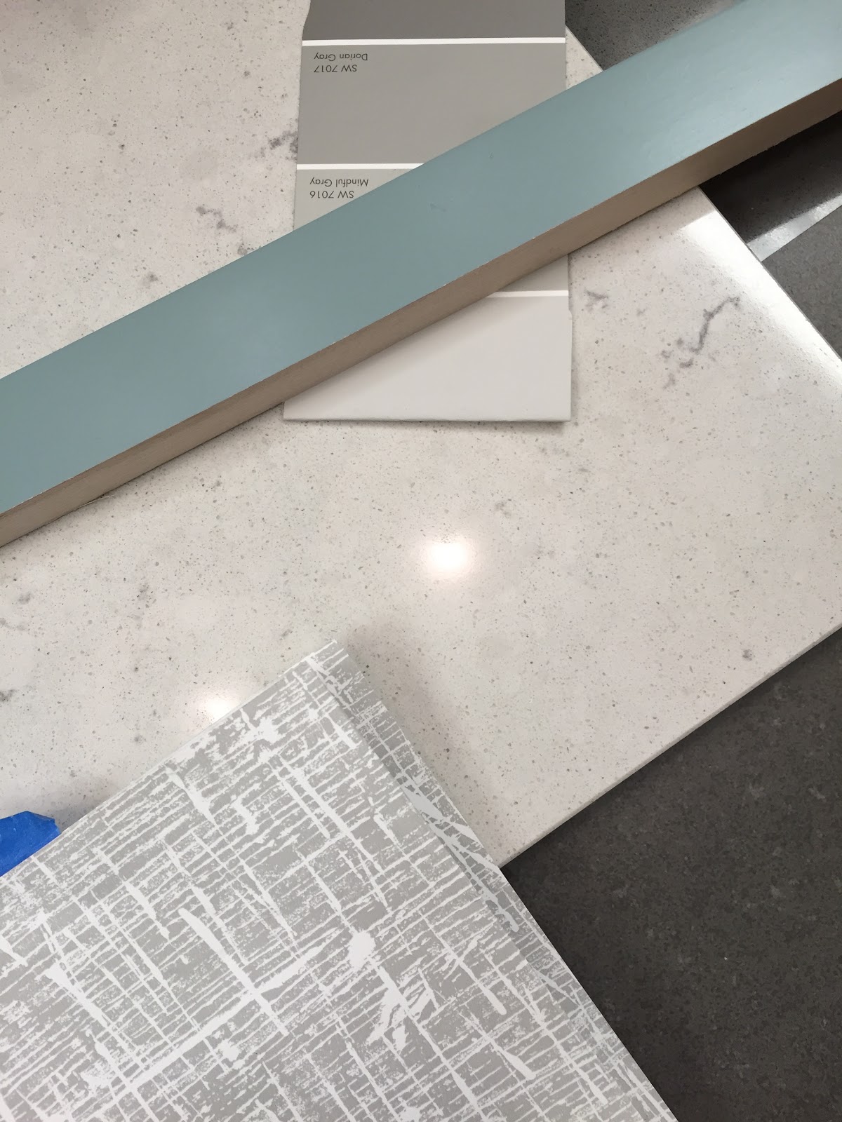
The floors had been selected and installed along with the cabinets.

Here you can see the starting point.
Then we looked at wallpapers....

You can barely see that one wall [on the right] is horizontal planks painted SW Repose Gray.
The one in the middle Designers Guild/ Kuta won out for a couple of reasons. It went well with the paint color and it's a small modern pattern so we can add some fun art.

This Cambria matched the cabinet color perfectly but I felt that over the years it might look dated and it kind of competed with the wallpaper....
Sometimes you just have to pull back to the basics. I have preached to you y'all how everything can't be the star/focal point in a room.
We went with [Cambria] Waverton. That way if you took down the wallpaper or repainted the cabinets....you are left with the dark gray floor and neutral countertops with a splash of dark gray. That can make life easy.
I am nothing if not practical.
Did you know that Cambria and Benjamin Moore got together and created paint colors to match their product?
Check it out.....here
You can discover some great things on Pinterest huh?
On the subject of wallpaper....I came across some interesting ones yesterday from Andrew Martin

Doesn't this look so real?

Here are a few more....


All great for an accent wall to add some graphic detail in a space!
OK....I am quite pleased after reading this post that I managed to stay on point. If my brain spilled out today there would be minimal structure of all of it's content.
Mush.
I'll leave it at that.
Shaboom
[as in explosion]


11 comments
That log wallpaper is insane! I had to do a double take. The others are pretty gorgeous as well!
Good call on the countertops!
The cabinet color is gorgeous! And I have Repose Gray in my house, too. LOVE it. The perfect gray, in my opinion. Can you share the cab color? This room is going to be gorgeous!
Great choice- I totally agree with staying neutral on the countertops. Love the tile floor. Xo Nancy
That First faux bois log wallpaper was on the wall at Bonny Neiman's store in Summit NJ and I just loved it!
I love the simplicity of the paper and counter it is timeless!
Cannot wait to see this all together!
Wow - those wallpapers are so cool... never them before. thanks for sharing!1 xo
Mmm I like your choice for wallpapers!
Nice and Clean Fulham
I am crazy about that Faux Bois paper...well I just love faux bois in general! Great choices in the laundry...totally agree about the counter!!
The wallpaper is amazing! I had to look twice, myself! Love your finish choices - it's going to be beautiful!
xo. Leslie
Segreto Finishes
That laundry room is looking awesome.
Great lesson from a great teacher!
Wallpaper is amazing!
Post a Comment