Y'all thanks for all the love on my wedding post!
Caitlin said she would send me all the info on makeup artist....hair stylist and wedding planner for anyone who is planning a wedding!
I am happy to report they are having a great time on the Honeymoon!
I'm turning the corner on this stinking cold and I hate to complain about it....but damn I am clearly not a happy camper.
Today I am helping my friend with an install....so excited because it's going to be fun! Stay tuned to instastories for all the details!
Can we talk for a moment about inspiration? It comes from everywhere right? I find that most of my clients use Houzz.....but most designers I know use Pinterest....weird huh?
Anyway "the gram" is also a place to find inspiration and see designers work. "They say" that you really don't even need to be published anymore....just post your work on insta......
Yesterday I was scrolling through Instagram and saw some pretty work featured on Birmingham Home and Garden from a designer I wasn't familiar with and when I went to her website my jaw dropped....
Meet Jan Ware Designs
Classic....timeless.
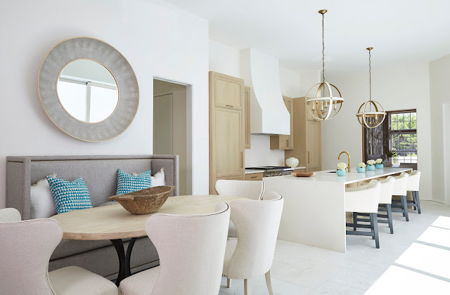
I love her use of reclaimed wood in this kitchen....mixed with gold!
We might be related somewhere along the line as I used that same light fixture just recently.....
When I saw this situation I got excited because I love a chaise......anywhere!!
The prettiest dining room with those pink curtains!
Gorgeous white and wood kitchen and dining area....
These pecky cypress paneled walls....mixed with all white is stunning!
I have used that Circa Lighting pendant before and it is one of my favs......
Can we talk about the stone wall behind the hood....I'm in.
I'm renovating a home and told the contractor to take out this situation in her bath but now I am rethinking because this is so pretty!
Are you with me here? Do you love her work as much as I do? In my opinion good design will stand the test of time....
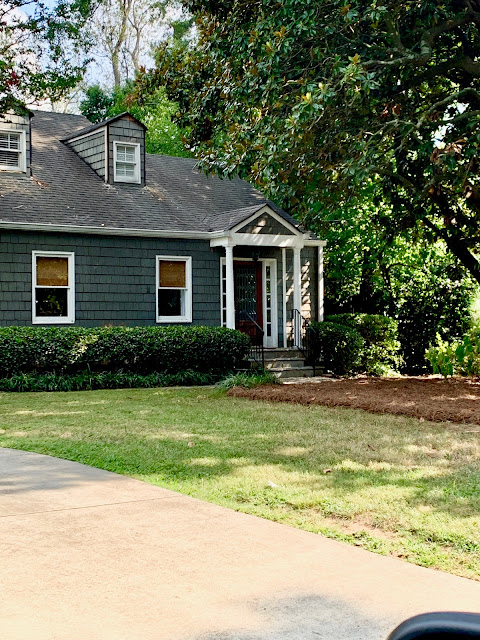
Here is a little update for ya.....my sister's house [that I did the ORC for in the spring] is getting some updates to the outside!
You almost couldn't see her house. There is a very large Magnolia in front and a few "weed trees".....
We had a some limbs cut and all the brush taken out. She is also having some rotten wood repairs and it is now painted darker with SW Peppercorn. I elected to remove the shutters....It's still ongoing as you can see...... the dormers aren't finished being painted yet. Those almost had to be totally re-done!
It's looking so much better!
And....last thing...
Our neighbors had us over for dinner last night and she served this cabbage salad.....I all but licked the bowl!
She did use a quarter of a white onion sliced real thin instead of onion powder and sprinkled blue cheese crumbles on top......Dayum.....so good!
Alrighty then....off to the install!
Friyay....
Sherika Freaka


5 comments
I vote for leaving in the vanity area with the seat. I haven't had one in the last 32 houses I've had even though the master bathrooms were huge. I miss sitting down and putting on my make up or sitting a kid down to do their hair. As I've gotten older I want a lighted magnifying mirror to do my make up. If I could redo my master today, I would definitely include a ladies vanity area!!
Glad you’re on the road to recovery, hate summer colds or anytime colds for that matter. I used to get design ideas from Pinterest but now I find Insta has more that I like. It might be a little harder to zero in on exactly what you want ideas for but it is my go to for most things design! Jan Ware is one fab designer, loved it all! Your sisters house will look great, has a lot of charm and character. Can’t wait for the end result!)
I’m with Anonymous! Having a vanity was not on my wish list before we bought our current house, but boy, do I appreciate it. At some point, stretching across a sink to squint into a far-away mirror to put on makeup just doesn’t work anymore. Sitting down at a pretty vanity and using a lighted magnifying mirror is so much easier. And it’s not as scary as some think. Once I started using the mirror close up I discovered that my dark under eye circles were just fallout from my eyeshadow! If your client has the luxury of a sit-down vanity, you might consider preserving that great feature (with a stool that affords more legroom than the one shown, of course).
I had my husband install a lighted makeup mirror on the wall for eyebrow plucking and makeup checking. In a former house, the vanity area was unused and was just one more thing to clean.
In the designer’s work above, it seems that there are a lot of chairs around very small tables...you could hardly get a cereal bowl each on there, although that may just be the camera angles.
Also, in the kitchen, it seems like it would be very dark in the kitchen at night. There seem to be no ceiling down lights, no under cabinet lights and the black metal lights chosen over the counter only make two concentrated pools of light, only onto the counter. Lighting is so important! Not a fan of this kitchen’s lighting issues!
I do love everything you have done to your sister’s house!
Sis's house looks wonderful!
That cabbage salad color is inspiring!
Pinterest is the way to go IMO....no drama on there!
Post a Comment